Takao Tanabe
At the opening reception for the exhibition “Takao Tanabe: Printmaker” at the Kelowna Art Gallery, I had a conversation with a friend of mine, who is a former arts administrator, in which I remarked that it would be interesting to hear the artist’s rationale for producing the fully abstract and hyper-controlled geometric screen prints, most notably the “Cut Corners” series, and related work from 1967–68. After all, the prints that preceded these late ’60s works were a kind of landscape-derived naturalism in the Ab-Ex manner. Her immediate and unsurprisingly succinct response was to say that back then everybody was doing that. Upon reflection I knew she was right, since abstract expressionism had by this time been largely supplanted, certainly in the mainstream, by pop art culture, hard edge abstraction, conceptual art, performance and emerging electronic media arts. You only have to look at Frank Stella’s abstract paintings from the late ’50s through the mid-’60s to grasp painting’s aesthetic shift away from the Ab-Ex ethos.
Back in the early ’50s Tanabe was hybridizing landscape features with an abstract formal vocabulary of mark-making, scribbles, solid planes and masses. While his success in doing so is open to debate, they are early works, so kudos to the curator for including them in the exhibition. That said, this type of work was characteristic of the era, particularly in Canada, which was slow to warm to Greenbergian arguments for art’s autonomy and non-objective abstraction, with some exceptions among artists working in Alberta, Saskatchewan and Ontario; for example, Doug Haynes in Edmonton, William Perehudoff in Saskatoon or Jack Bush in Toronto. In British Columbia the tendency was to personalize explorations into abstraction through reference to subject matter drawn from natural and lived environments. Since Tanabe was born and grew up in Prince Rupert, the coastal environment was deeply embedded in his psyche and artistic sensibility, and while he chose to step away from this backdrop for some time, in the end it has been his west coast prints and paintings that have come to define his career.
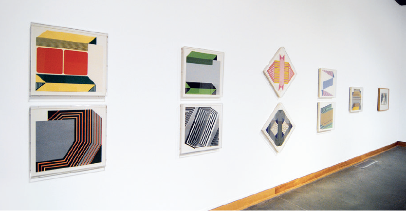
Takao Tanabe, installation view, “Takao Tanabe: Printmaker,” 2023, Kelowna Art Gallery. “Cut Corners” series. Photo: Kyle L Poirier.
“Takao Tanabe: Printmaker” was guest curated for the Kelowna Art Gallery by Ian Thom. It is a comprehensive exhibition featuring many of the key images produced over the artist’s 75-year printmaking history, with all artworks on loan from the Vancouver Art Gallery and the Winnipeg Art Gallery. The excellent catalogue reproduces all of Tanabe’s prints so it is a valuable resource for that side of his career. Perhaps the most impressive feature in this publication are the details of each print’s production, including edition size, printer, print publisher, paper type, number of colours, blocks and so on. Additionally, there is an essay by Ian Thom, where he tracks key episodes in Tanabe’s personal and artistic history as well as providing analysis of numerous prints drawn from the abstract work, the prairie and the west coast images. Kelowna Art Gallery curator Christine May also contributes a fine essay, focused on prints Takao Tanabe did in 2010 during his visiting artist assignment in the Visual Arts Department at UBC Okanagan campus, in Kelowna. In the printmaking studio with the assistance of then BFA student Laura Widmer, he produced a small series of colourful abstract block prints, some of them featuring embossing, and all of them making generous use of the white paper surface to create a lively distribution of motifs. In a conversation with Tanabe at that time he intimated that the idea for these prints first came to him when he lived in New York in the early ’70s. However, their intended production was never undertaken at the time.
My impression, not discounting the topicality of abstraction in those early years, is that Tanabe felt compelled to challenge himself in a fully abstract manner so as to later feel secure in setting that aside in pursuit of content more germane to his life and artistic inclinations; in essence, freeing him up for an interpretation of the landscape subject, all notably marked by a devout allegiance to the integration of land formations, atmospheric conditions, light and colour. Here he was realizing a decidedly romantic vision, particularly in the west coast images. On the other hand, in the prairie landscapes from the mid- to late ’70s we can see the drawing activity dramatically reduced, substituted by a decidedly enhanced colour saturation and a seemingly internalized vision of light and colour overriding any commitment to naturalistic accuracy. At this time the artist had clearly moved toward a more chromatic admixture palette, and while his distribution of colour ties the work to the representational subject, you sense that these prints have been guided more by aesthetic decisions than observational depictions of the landscape per se. That is to say the prairie prints are by definition sky and land subdivided by the ubiquitous horizon line, done mostly in lithography, with a few etchings and woodblocks. Lithographs such as The Land, Summer; The Land, Spring; The Land, Autumn, from 1974, all printed by Jack Lemon at Landfall Press, Chicago, epitomize Tanabe’s prairie landscapes. As much as there is to admire in the abstract reductivism of the subject matter, the artist’s reliance on the bisected compositional format falls perilously close to a conventional cliché in this particular subset of the landscape genre. Granted, this composition format allowed the artist to reference the flatness of the picture plane and to showcase the near-abstraction of his colour palette.

Takao Tanabe, Malacca Strait: Dawn, 2004, 4-colour mixed media: woodcut, etching, aquatint, 71.5 × 172.5 centimetres. Collection of the Vancouver Art Gallery. Gift of the artist and Anona Thorne. Printer: Peter Braune, New Leaf Editions, Vancouver. Photo: Kyla Bailey and Ian Lefebvre, Vancouver Art Gallery.
In the ’80s Tanabe’s work took on a more graphic quality, with a reduction in chroma and an elevation of line and visual textures. The lithographs have a distinctly “painterly” appearance, while the woodblocks favour an atmospheric treatment. See Skincuttle Bay, 1986, and On the Road to Banff, 1983, respectively. Tonal and chromatic subtleties abound in each printmaking process, so if you were to wrestle with and hope to grasp the Tanabe aesthetic, an argument could be made for these characteristics as a good starting point. The subject matter are prairie and coastal landscapes. The woodblock and aquatints of the ’90s and aughts have benefited from the lithographic prints of the previous decade insofar as they exploit the painterly treatment hitherto limited to the wet-medium and drawing approach of lithographic printmaking. In doing so they are, to be sure, moving closer to Tanabe’s canvas works that fully utilize the wet-in-wet process and the linear demarcation of planar surfaces; for example, Cook Channel, Nootka Sound, 1996; Inside Passage, Stephen Island, 2007; and Malacca Strait: Dawn, 2004. This latter work is a four-colour mixed-technique print utilizing woodcut, etching and aquatint, and is a large piece measuring 71.5 x 172.5 centimetres, printed by Peter Braune, New Leaf Editions, Vancouver. The most recent print in the exhibition is a two-plate photogravure titled Cormorant Island, 2023, also printed by Peter Braune, in an edition of 25, with one copy acquired for the Kelowna Art Gallery permanent collection. “Takao Tanabe: Printmaker” is an excellent exhibition that presented a rare opportunity to view a substantial selection of this venerated senior Canadian artist’s prints. ❚
“Takao Tanabe: Printmaker” was exhibited at Kelowna Art Gallery, Kelowna, from July 1, 2023, to October 1, 2023.
Gary Pearson is an artist and professor emeritus at UBC Okanagan, in Kelowna, BC.